Thursday, 28 March 2013

'Boom-Boom' Early Concept Work...

This piece I envision to precede 'The Bird'...So they are the ying and yang of one another. I have written that I visualised The Bird to Pan upwards from the ground. So with this preceding the latter, I intend to start at the sky and meet the other shot at the ground and provide a link between the two.
Hence...


Getting some colour... 

Inspiration...


For this piece, I wanted to create something that felt like a slick, richly stark 1980's movie, that takes place in downtown Los Angeles rural area with high contrast colouring and a general 'neon' night-life vibe that added a sense of electrocution to the piece artistically. This


All layers are finalised and ready to go as PSD layers. This will be taken into after effects as the finished Photoshop file, with all layers uncompressed, so that when I apply a 3D Camera to pan down, it will read the layers seperately and give a sense of depth of field to the layers as it pans down to the base of the scene. 


With succession, this is the final output from Photoshop. It is of simular size as the composition of my video, which is 1280x720 however, a little bit of room has been extended at the sides to allow for any extra camera shake, should I need to shake the camera to emphasise the explosion that will take place in the composition. 

Thursday, 7 March 2013

Early Days... The Bird

Because my show reel is about Animation, I want to make sure I can get some great quality animation pieces in there. The number is not so important; as long as the pieces are of the best quality. Two things that first sprung to my mind that I have not animated and up to present remained hesitant to do, is an explosion (which yes I have done before, but I wish to attempt one on a bigger scale, and play with timing a little more) - an effects piece of animation, and a Bird-cycle. Now to integrate these into a narrative piece, I intend to foster these animation sequences into what I like to call 'Mini-Movies' which are contained little pieces that are immersive in their own right, for just long enough to keep an audience hooked on it, but it's not such a loss when the next piece begins amidst the reel.

To begin with 'The Bird' as I call it; The Bird will be an inspired little bird-flight cycle that I intend to hand animate using the Wacom Bamboo. Below are a couple of concept sketches and colour-keys that I have created in the last week that I hope i can get working in the final piece.


Mood Board/Section of design inspiration...


I love the Golden Age Limited Animation cartoons. They are the ultimate source of inspirational fuel for my own work. The impression of illusion that they achieve through their limitation in artistic direction is what gives them their ultimate charm. The very idea that these artists would use only triangles to create the impression of tree's - versus the use of more intricate artistic methods to acheive the same result, when to an audience more interested in gags and characters, it's just a tree is truly remarkable. And I find myself revisiting the area that I feel a connection with and adding a new piece of animation (a bird-cycle that iv'e never tried before) that will compliment the piece, and 
push my animation abilities even further at the same time. 


So from the mood board, here we have the earliest sketches that I mocked up, that just visualise the art style I wish to visit for this piece - any sketches that can run away with themselves in this style, just to develop intricate shapes and designs to make the mini-movie ever more appealing will be an asset to the final piece.


More environment development... Shape development. 


Early morning Cloud Sketches, 


The Final Storyboard and shot - plan. 


So I want the shot to pan upwards, from the ground so that it helps create that sense of place - establishing that, before showing the bird in flight will make compliment the piece visually, but also make the bird seem more convincing in it's environment. 


The road that i decided to integrate into the final design is, I must admit a homage of sorts to the Matte-Backdrops used in 1939's timeless 'The Wizard of Oz' where the yellow brick road's perspective is artistically warped to look almost normally impossible in the far distance in the backgrounds. This illusion not only gave Oz it's distinctive look, it helps separate it from reality and keep it in it's own strong world basis - which in my own design, is something that I wanted to create. 


And Colour Mood-boards, and finalised colour choices. I wanted to make it feel very natural, and not so artificial, and not stray towards something that did not feel natural. I am afterall warping reality to my advantages and turning it on it's head essentially, and so I feel that using the right colours and lighting practices will not only help pull it down and make it more plausible and recognisable naturally without force, it will also look like it's meant to, which is very naturalistic. 


So extracting colour idea's from the images above, which are taken from forests scattered across the U.S State of Oregon, I have presented this colour palette - which allocates sectors to my deisgn. The greyscale in the finalised design allows me to also recognise my depth in my shot as of when it comes to applying colour. 


Hence...


I do however, want to put a little visual twist on the character animation. I don't really want to use the 'clean-look' character line use in Limited animation. Instead I want to break the mould a little bit, and integrate a little bit of my raw, visceral sketching line quality into the polished piece. So essentially it looks a little bit like a coloured in-pencil test. At this moment, i'm also thinking that the rawness of the line quality will also help give the bird some character - of it living in the wilderness and it not being well groomed like a zoo or home-kept bird. This in turn will give the bird character. 

Monday, 18 February 2013

What 'The Walt Disney Company' Thinks!

The Walt Disney company also supplies an array of information on each individual job role in both the artistic and technical departments.

http://www.disneyanimation.com/careers/careers

Wednesday, 13 February 2013

Links iv'e been following for Show Reel Tips

Links on Demo reel's and FAQ's on Demo-Reels...

Studio of interest to me, Blue-Zoo...

http://www.blue-zoo.co.uk/jobs/


http://www.digitaltutors.com/11/demoreel.php

http://www.animallogic.com/#Jobs,FAQ

http://www.pixar.com/careers/Career-FAQs


Pixar - What do you look for in Animators?

One of the most common questions Pixar receives nowadays is, “How can I become an Animator at Pixar?” There’s really no good answer that’s both short and useful, so we’ve put together some information tohopefully provide guidance for people who dream of being involved in Pixar's animation process. Pixar places the technology of computer graphics firmly at the service of the art of animation, not the other way around.  This priority is expressed clearly in Pixar’s production process, in which the Animators specialize in animation, with virtually all technical concerns handled by Technical Directors. The implication of this structure and this value system is what Pixar looks for first and foremost in Animators—we want you to be able to bring the character to life, independent of medium. Computer-graphic technical prowess is of course important, but the emphasis is not as strong within the Animation Department.


The reality is that computer graphic animators have no advantage over pen-and-ink animators, clay
animators, stop-motion animators, etc. So while it’s preferable for someone to have 3D knowledge, it’s
not paramount. In fact, three-quarters of the Animators on Toy Story were new to computers when hired.
A common question is, “What software should I learn?” The answer is implied by the above: “Software
doesn’t matter; learning to animate matters.”
Still, you might expect that learning the software that Pixar
uses would give you a leg up. However, even this isn’t true: Pixar uses its own proprietary software. Your
knowledge of basic animation fundamentals is the foundation for your computer training,
not the other way around.


A Pixar Animator should be able to bring life to any object or character, showing the character’s internal
thoughts and feelings through its physical external motion.
To do this, the Animator must be a good actor. 
His or her work should communicate clearly, containing simple ideas with which an audience can empathize. 
The animation should be entertaining to watch, employing good timing and relying on individualized, believable
characters to put forth humor and emotion.
The Animator also needs an understanding of physical motion. 
Knowledge of weight, balance, overlap, texture, and form should be evident in the work. In fact, in evaluating a
prospective Animator, Pixar relies very heavily on the demo reel presented by the candidate.


"I'd rather see 15 seconds of amazing animation than 3 looooooooooong minutes of an unwatchable film.
Those 3 minutes can feel like an eternity if everything isn't perfect."


"You’re applying for Animation? Well—show me good animation! Show me acting.
Show me thinking. Show me a character that is alive. I don't care about lighting, modeling, shading, particle effects,
or how clever you are. Blow me away with something I've never seen. An original character with
a distinct personality!"


Employers often look for life drawing and real life observational drawings that display a sense of weight and proportion in a variety of poses - that demonstrate that the prospective employee understands the way that real life anatomical fundamentals work so that they can then use this gift and translate it stylistically onto the screen in a piece of Animation performance. 

Tuesday, 12 February 2013

An Introduction...


The idea that I could create a title using the fundamentals of what we first learn as Animators (The bouncing balls) and intermix it with a simplistic design that reads well to a viewer; was something that instantly appealed to me looking at it from an animation/designing perspective. Something that could perhaps be seen as something that was memorable. After all, that's what we aim to give with the Show-Reel. The Memorable. So I came up with a design in Photoshop, using typography that could both read clearly whilst in motion and look effectively 'zany' & 'cartoon' which I really wish to capture in the flow of the work. This in turn inspires my style so collectively everything functions like clockwork. 


Initial photoshop design. 


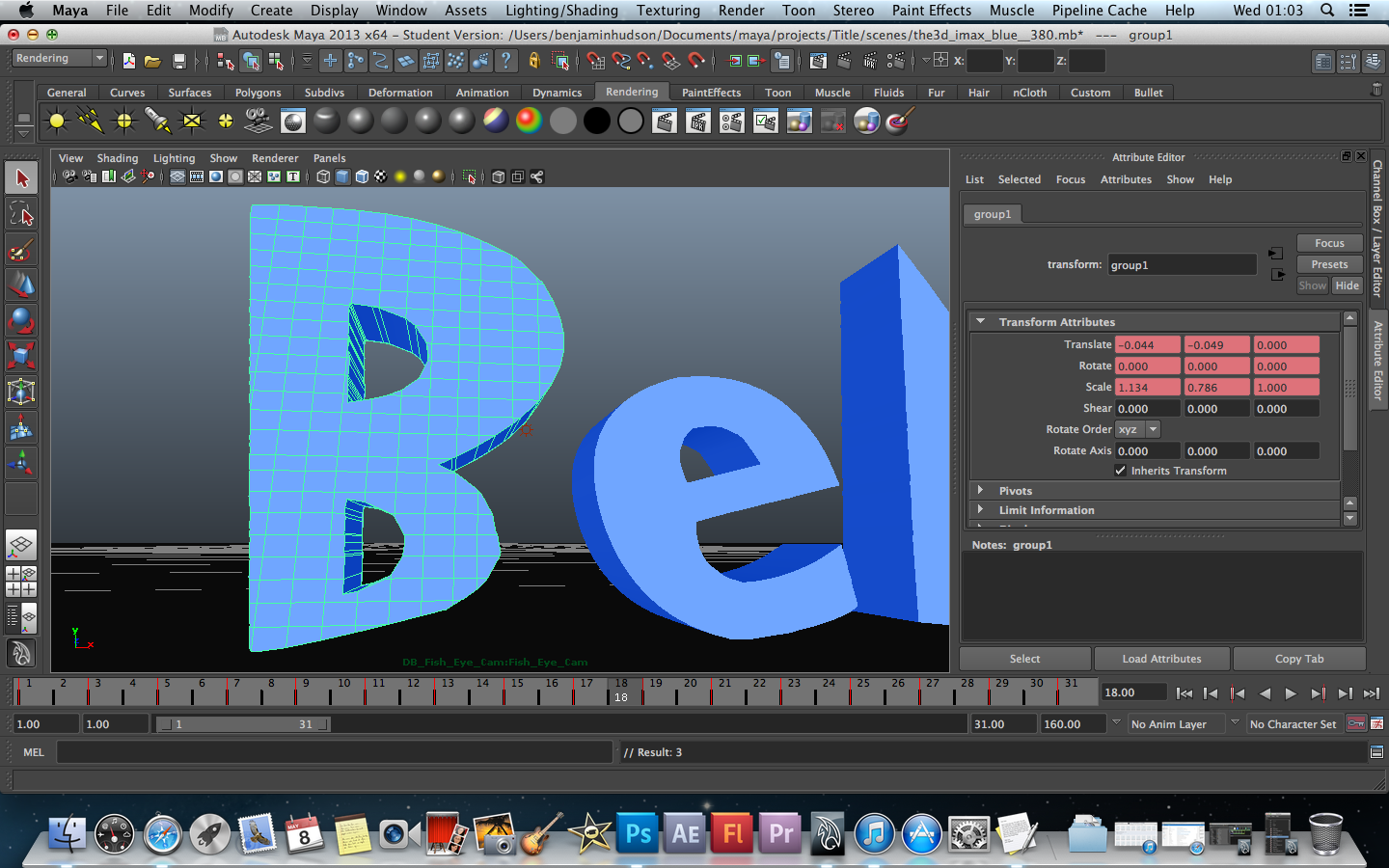
The Photoshop design was then taken and built in Autodesk Maya using 'Create Text' and 'CV Curve Tools' (for the more intricate area's) and the design was then extruded to essentially build the lettering. If flat, like in the image's, then the design wouldn't be plausible and it would be difficult for us as viewers to interpret the grounded physics of it. So extruding the lettering gives a sense of scene, a sense of physical visual place, no matter how stylistic you get - which to bring the directing streak into things, is what the illusion of animation is all about. Shadows and a little bit of reflectivity were added just to add to the world that the lettering is interacting with. 


The design being first constructed in Maya. Before extrusion. 


I then set up a 2-Point lighting system that would give the front of the lettering facing the camera the most light, whilst the back would also receive some ambience so that it would not be definitively darker than the rest of the piece. That element of consistency was always an important aspect to giving this piece a nice, even balance all around. 

 Extrusion, lighting & scene set-up 


 Animation keys been altered on the letter 'B' (see Animation timeline)

 By this point, the animation was also being worked into and steadily completed. I only needed to animate the first 31 frames of each letter and keep their poses inconsistent to keep a bettered sense of variety and character between them; so I could apply the Post-Infinity-Cycle with Offset option in Maya's Animation Graph Editor for the letters to bounce for what would literally be; forever. But for timing's sakes I only need 5 seconds worth which would need 120 frames. 5 seconds is long enough to grasp a sense of what is happening and read the text.

Going overboard and adding too much was always something that I was very cautious about; so I decided that my floor, the base of the scene which would interact with the lettering would also connect seamlessly with the background. This was achieved using Maya's 'Use Background' option in the Hyper shade. However, the effect only works in the final render and through the Camera's view.


Playblast of the animation in progress...


The same was done for the end contact details that will narratively round the show-reel off. The way I think of this, is as 'The Lord of the Rings trilogy' where, we start off in the Shire, and we return there after an proportionally epic adventure at the very end, so I wanted to bring that recurring motif back to complete everything, and not throw too many design aesthetics around.


I'll be back with more!


Thursday, 7 February 2013

Another 2D Animation

This piece of 2D Animation explores liquid territory a little, as it takes it's inspiration from the gloopy, laser gun effects from the Disney film Lilo & Stitch (2002), It also challenges me to be a little more careful with line work, which can run away with itself in Flash, and also play around with Masking objects and certain parts of the work to get a desired effect, and change the middle-part of the colour, if desired. The outer movement is inspired by a mixture of the Waves I had previously created using Autdodesk Maya and the way horses move their heads and upper bodies when they gallop.


The image below shows that In the Film "Lilo & Stitch", that even the ocean has a certain, artistic design even from one still, how gloopy even the ocean is made to look, as well as the alien laser beams.